


(500) Days of Brands
I’ve had five brand shifts in the 500 days since launching my business. Here’s what I let go of, what I love, and what I’ve learned.
Before I launched, I wanted a look for my brand. Not too surprising for a vision board girlie, I guess.
I’ve done marketing for years, so I had instincts. Opinions. As any real graphic designer laments—I had just enough Canva knowledge to be dangerous, a mood board I liked, and a strong desire to hold space for people navigating emotional struggle.
What I didn’t know then: I wasn’t going to stay in a single lane for long.
My skills integrated.
My services expanded.
My clients shifted.
My role evolved.
And with each adjustment came a new visual, a new tone, a new answer to that classic question behind every marketing decision: who’s the audience?
The Westwind Calls
I didn’t start with a logo.
It started with a vibe from a Winslow Homer painting.
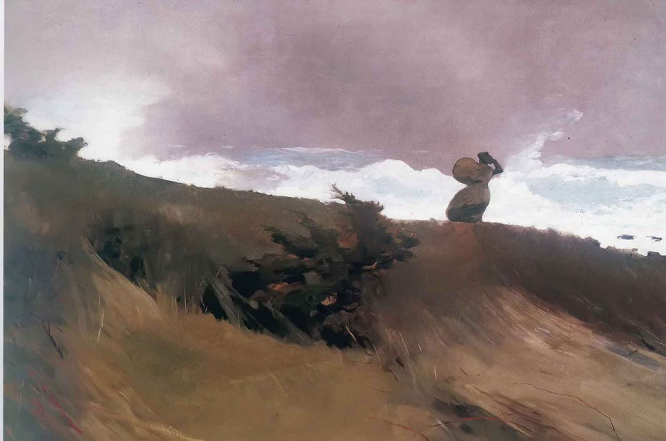
Muted purple. Hidden navy. Curves that felt like breath. Windswept.
The brand was built for stillness, for sadness—for people in pain, in process.
I wanted it to feel safe because at the time, I thought that was the audience: people who were struggling. To offer coaching as a kind of emotional bridge.
But what I came to appreciate is that struggle is sacred—and coaching isn’t always the right container for it.
Coaching is not the first step out of misery, depression, trauma.
It’s a step forward from that past.
It’s the bridge from where you start, to where you want to be.
It’s hopeful.
It’s optimistic.
This called for more color.
A Shift To The Shore
The brand needed light.
I wasn’t offering crisis support. I was working with people who were ready. To rebuild. To move. To begin again.
So I brightened the palette.
I pulled colors from Lake Michigan sunsets—photos I’d taken myself, back when I didn’t know they’d become a visual compass.
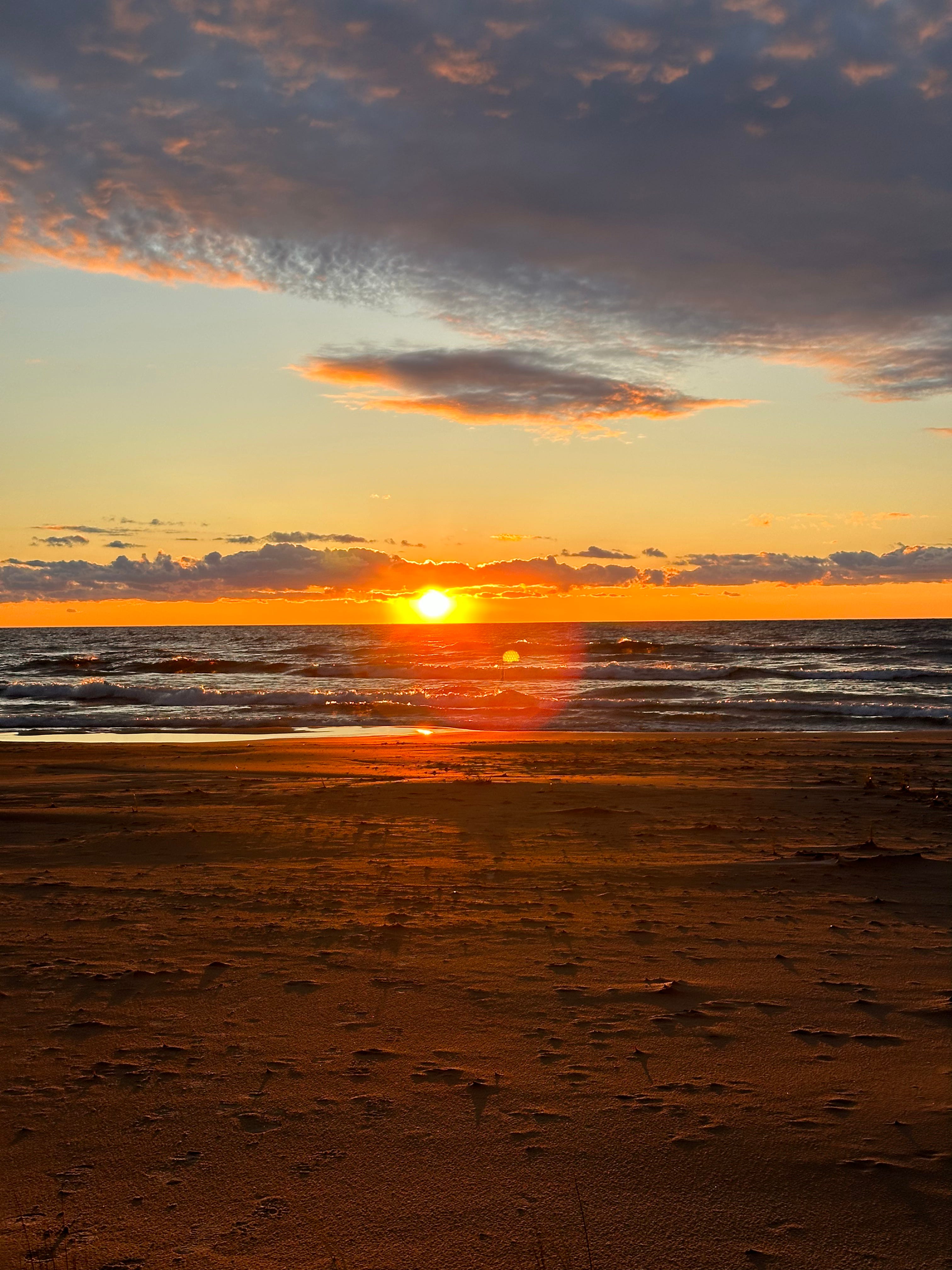
Golden saffron. Slate purple. A coral that hummed.
The Canva logo stayed.
But now it sat beside colors that spoke of hope—not just healing.
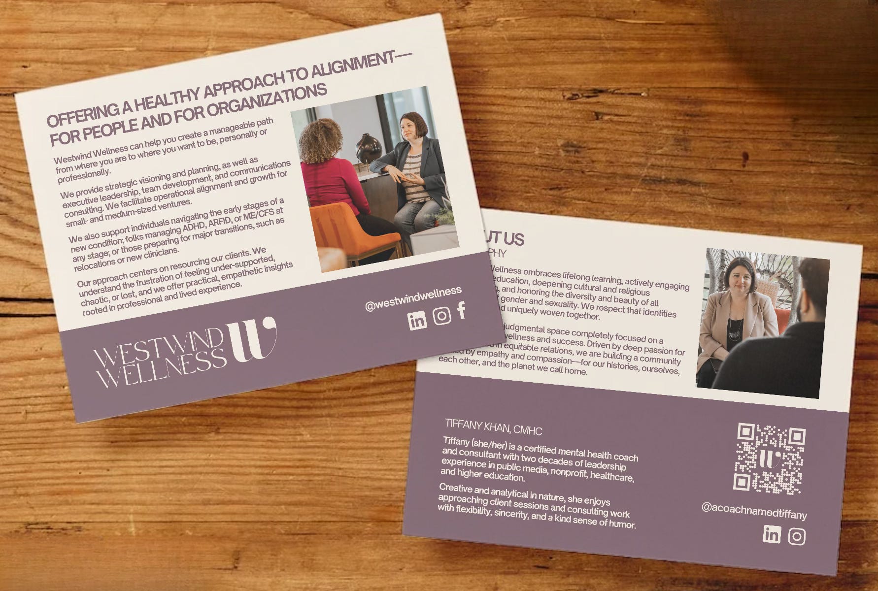
The Look Of Launch
By the end of the year, I was ready to go public.
Brand photos. A more confident tone.
I launched in January 2024.
The focus was still 1:1 coaching, but the brand had grown up.
It spoke more clearly to providers.
It lived on collateral.
It had a structure.
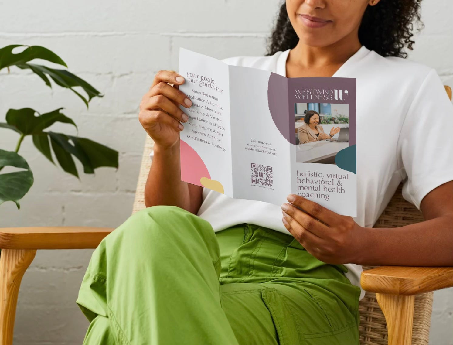
The muted plum held steady.
But the palette narrowed.
And underneath it all, something new was forming—
I was starting to offer more than coaching.
I just hadn’t named that yet.
Coaching Meets Consulting
Somewhere in the middle of client calls and provider referrals, a shift began.
I wasn’t just coaching.
I was building systems.
Consulting on operations.
Helping teams move through change with clarity and care.
I was embedded inside a nonprofit, almost without meaning to.
Giving feedback on marketing, strategy, team structure.
And what surprised me most?
How much the coaching lens helped.
The listening. The pacing. The restraint.
The ability to see what someone’s trying to do—and help them do it without overriding their vision.
The work had moved on.
But brand hadn’t moved with it.
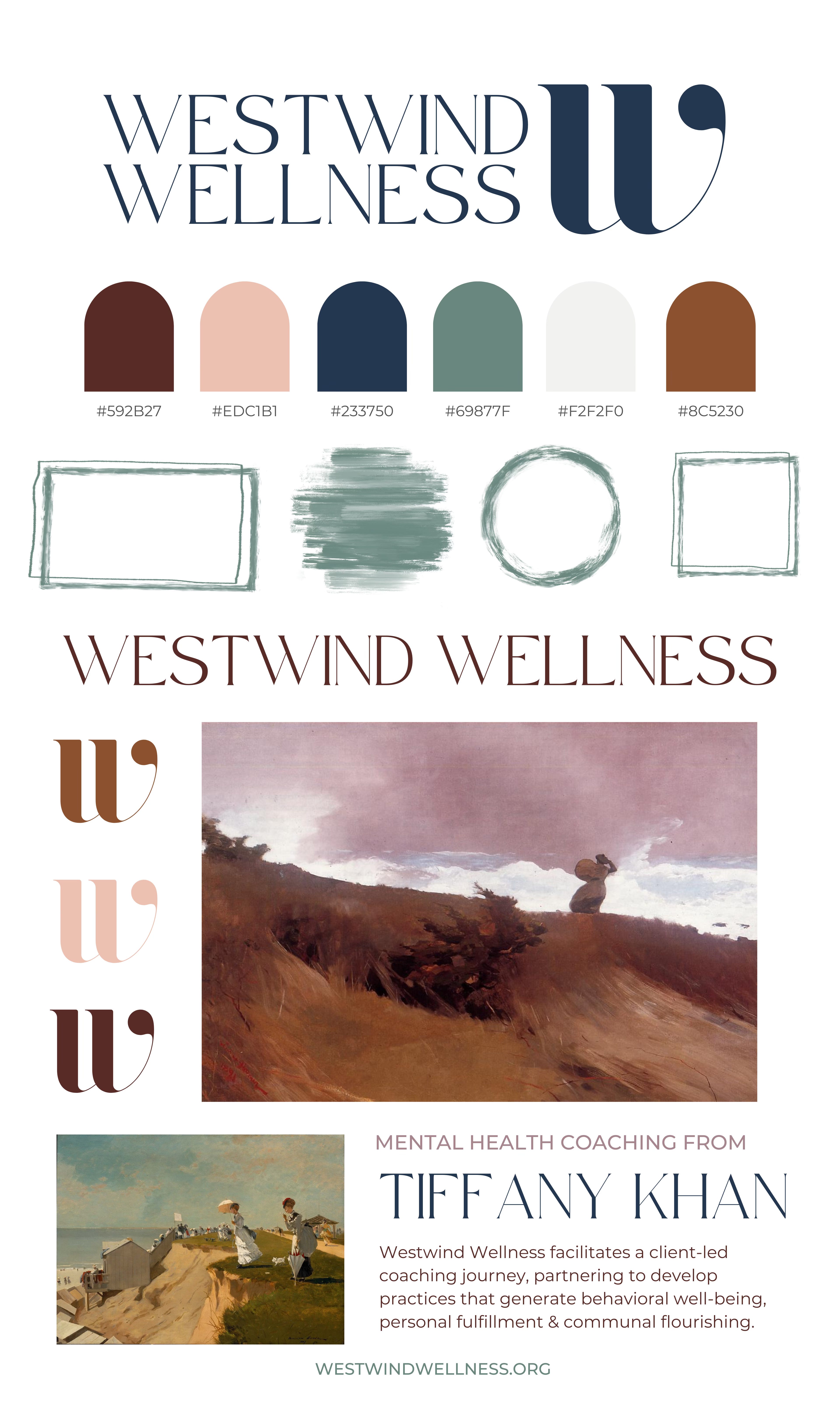
The Real Brand Begins
The business had stretched.
The offers had shifted.
The audience had changed.
It was time for the brand to catch up.
And no amount of Canva tutorials were taking me to my next level.
So I reached out to Chelsie Tamms of Lettering Works.
She brought clarity and the exact creative discipline I needed.
We went through three rounds—refining, simplifying, zooming in.
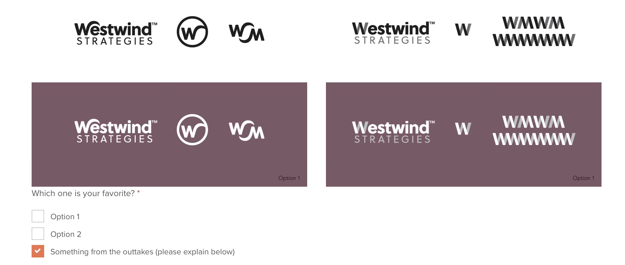
I didn’t want woo. I didn’t want corporate.
I wanted the space between:
something that felt elevated, editorial, strategic—but still intuitive.
The result? A logo and mark with flow and strength.
This wasn’t a glow-up.
It was a lock-in.
The name changed.
The tone sharpened.
Westwind Strategies had arrived.
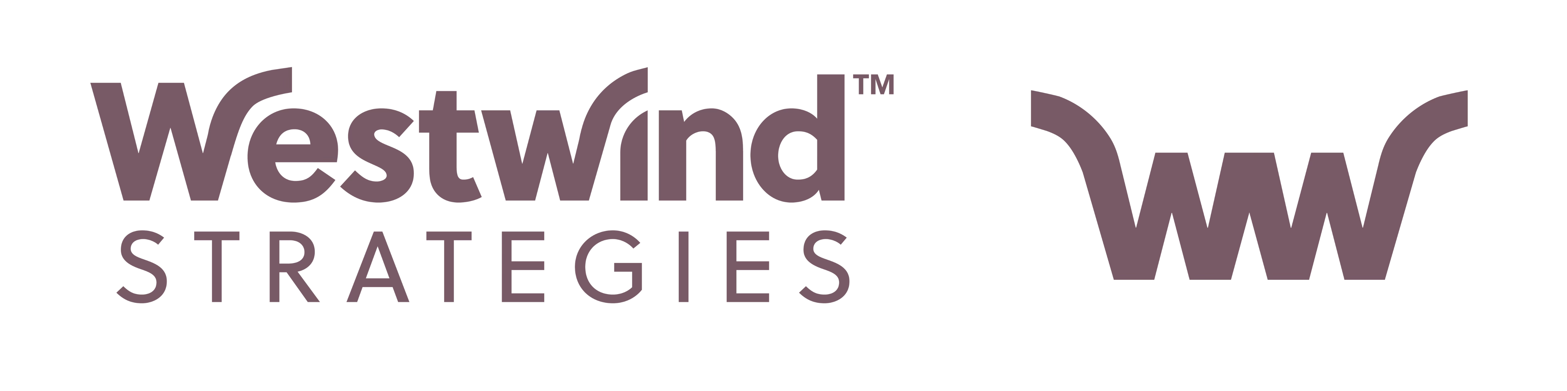
Strength, Even When The Scale Is Small
After a few months with the new brand in the world, I noticed something.
My original mark—elegant as it was—got lost in small spaces.
It didn’t hold up at 40x40 pixels.
So I went back to Chelsie.
She reworked it, quickly and perfectly.
Not to reinvent it—just to sharpen the signal.
The final “W” stands on its own.
Confident. Clean. Still carrying the wind.
It’s the mark I use now in every small space—and big ones, too.
Because it holds everything the brand has come to mean to me—and it’s the promise I make to my clients:
Approachable and adaptable
Capable and clear
Strong and strategic
The Win Behind The ‘W’
So, yes, I absolutely overdesigned at the beginning.
I poured seriously valuable start-up time and energy essentially decorating a cake that was not even fully baked. A lot of time was spent tweaking the kerning on fonts I didn’t know how to export into vector files—instead of connecting with colleagues, building my network, practicing my coaching craft.
I cared deeply—because I cared about the work.
A beautiful thing, to be sure:
but thank God I didn’t spend a dime on it right away.
Not until I’d lived inside my business long enough to know what it actually was.
Not until I had clarity on who I serve, how I work, and where I’m headed.
When that clarity showed up—I called in a pro.
Chelsie helped me shape a brand that could hold everything I’d been building.
Because, at the end of the day,
the best brand look isn’t the one you start with.
It’s the one you’re excited to build on.
—T
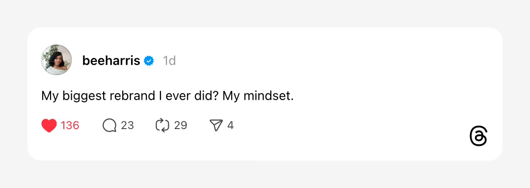
P.S. - Saw this Thread from Brittany Harris as I was working on this post—and it’s total perfection:
How are you rebranding—your business or your mindset? DM me & let me know—I’m on Threads and Instagram, or you can reach me via text at 602-488-5550.